Video
About
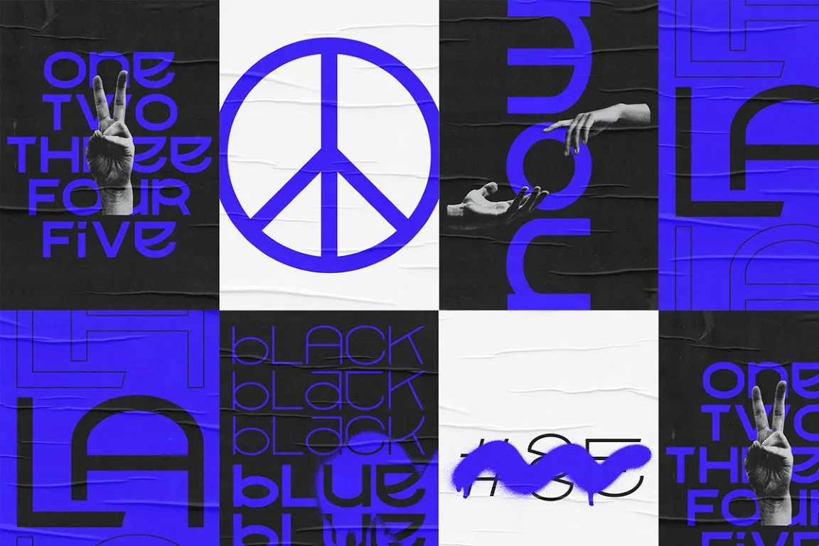
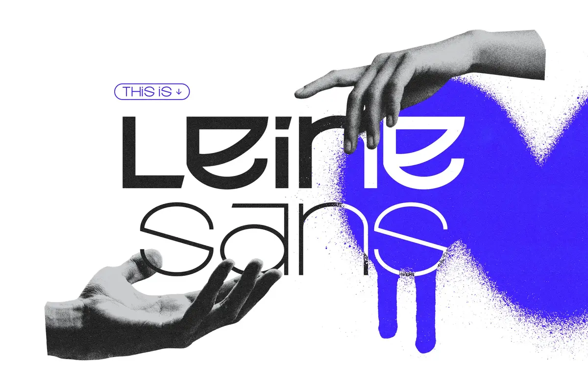
The German graphic designer Phillip Bolduan launched the Unicase typeface “Leine Sans” in 2021 and sought to create a compelling promotional video to highlight its features. Having previously collaborated on the visual style for three music releases by Erdmann, I was thrilled to have the opportunity to return the favor. Leveraging my expertise in 3D design, I contributed to the creation of dynamic and engaging visual materials for the “Leine Sans” promotional video. This project not only allowed me to support a talented designer, but also to showcase the versatility and creativity that 3D skills can bring to graphic design and typography.
Process
To emphasize the significance of “Leine Sans,” named after the river “Leine” that flows through Phillip Bolduan’s hometown, I opted to create fluid, flowing projections of the typeface. This conceptual choice aimed to visually represent the natural movement and dynamism of the river, mirroring the elegance and fluidity of the typeface itself.
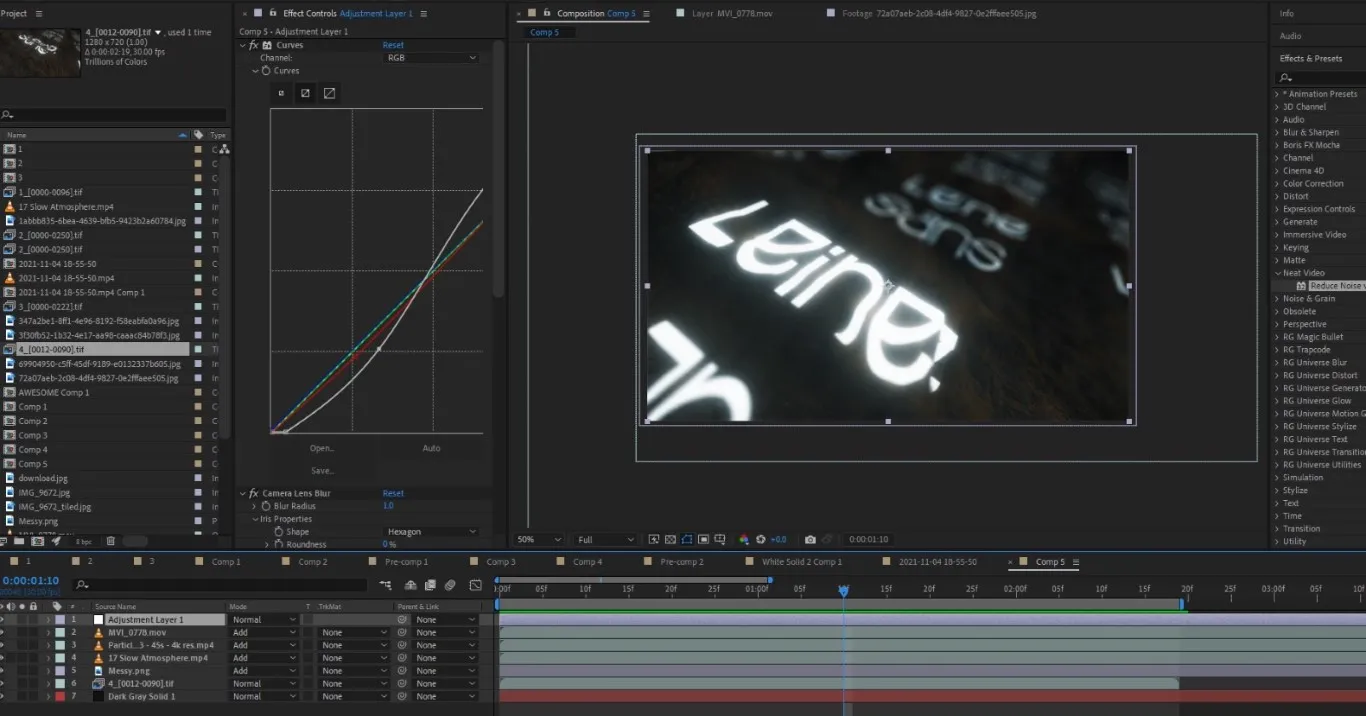
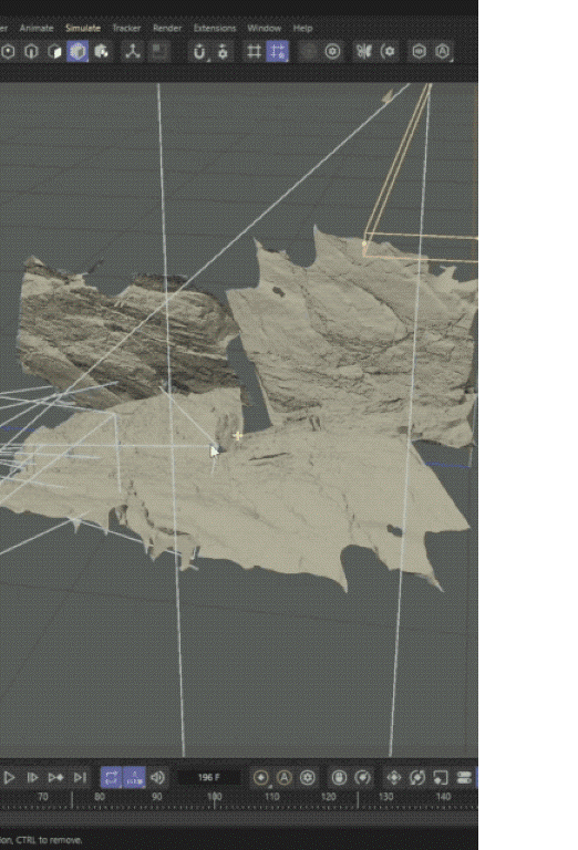
To achieve this intriguing and realistic movement, I needed to incorporate complex geometry into the design. I decided to utilize a collection of photoscans I had taken years ago during my travels in Norway and Canada. These photoscans, which captured intricate and diverse natural landscape details, were processed in Meshroom to create their complexity and detailed mesh. The varied textures and forms from these photoscans provided the perfect foundation for creating the flowing, organic motion that would bring “Leine Sans” to life in the promotional video.
WIP Timelapse
DOWNLOAD THE TYPEFACE